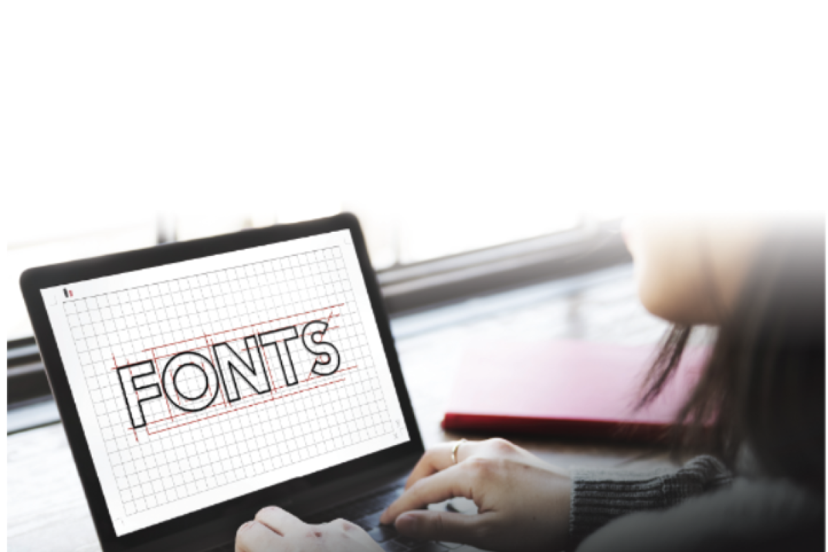
How fonts have evolved through time and why there are so many
Whether you’re into clean and simple designs, or bold and flashy ones, it doesn’t hurt to learn a bit about the options out there
 There are thousands of different typefaces to choose from these days
Logos like Google or Disney are so familiar to us that we probably don’t question how they’re created. Did the design of the letters in the Disney logo exist before the company did?
Different letter designs – known as typefaces – are all around us. We see them in newspapers, on adverts, and on a lot of the products we use. But those typefaces didn’t appear out of nowhere. The design of every printed or digital word we read had to be created first.
Here’s how those designs have evolved over time.
Font vs typeface
If you’ve ever used Microsoft Word or any other computer office programmes, you probably would have seen that the particular look of a letter is known as font. But if we’re being picky, font actually refers to the size of the text, or whether it is in bold or italics, while typeface is what we should call the design.
Serif vs sans serif
Unlike with digital reading, you can’t zoom in on printed texts. So in the past, to make chunks of printed text more clearly-defined and easier to read, small lines – called serifs – were added to each stroke of a letter.
Now, we’re more likely to read text on a screen than on paper, so it’s much more common to see sans-serif typefaces – letters without serifs (sans means “without” in French). Sans-serif typefaces are often used by companies to make their product look sleeker and more modern. Google, for example, changed its typeface from serif to sans-serif in 2015. Did you notice?
What does your typeface say about you?
There are now thousands of different typefaces to choose from, which is just as well, considering how often we have to use them. But like any product, typefaces are designed for different purposes and audiences.
Some typefaces have a long, illustrious history. Times New Roman, for example, was first created in 1931 by designer Stanley Morrison for the British newspaper, The Times. It was intended to have a feel of authority, so that people would put their trust in the paper. Funnily enough, The Times no longer uses Times New Roman. A new variation, Times Modern, was created in 2006.
Sorry, you’re just not my type
Not all typefaces have stood the test of time as well as Times New Roman. Comic Sans was created in 1994 as a fun throwback to the comic books of the 60s.
In the early days of personal computers, Comic Sans was a popular, easy-to-read alternative to the harsh look of Times New Roman. Yet in more recent years, it’s become the joke of the typeface world, synonymous with children’s birthday parties, not to mention the cute-but-silly Doge internet meme.
As for just about every other meme on the internet, the typeface you’re seeing is Impact – a creation that actually goes all the way back to the 1960s, when it was intended for use in advertisements. It began its second life in the early 2000s, when it was used to add text to memes of the internet’s other favourite thing: cats.
A modern stereotype
Another typeface which is enjoying a moment in 21st century pop culture – but again has been around much longer – is Helvetica. It was developed in 1957 in Switzerland, and was originally named Neue Haas Grotesk. Its name was later changed to Helvetica, which means “Swiss”
in Latin.
It was designed to be clean, clear and, importantly, neutral – just like its namesake. Now, it’s the typeface of choice for hipsters everywhere – although surely any self-respecting hipster will have long ditched Helvetica in favour of something less “mainstream”.
