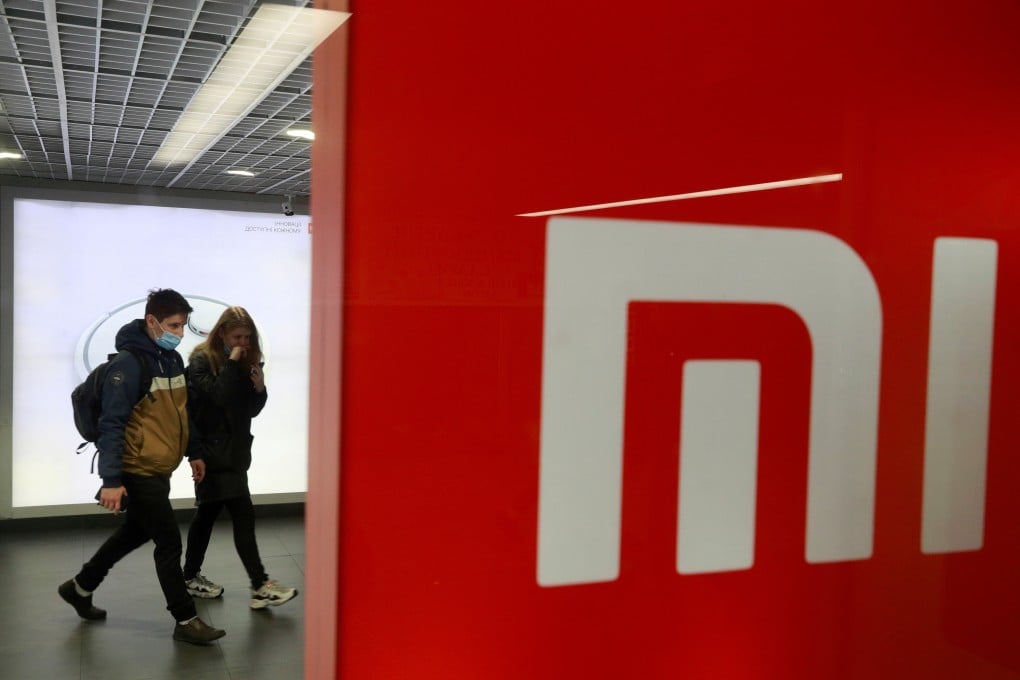
Xiaomi’s new ‘squircle’ logo becomes the butt of online jokes with many claiming they could have made it for much less money
- Smartphone maker Xiaomi reportedly spent US$300,000 on a new logo inspired by Eastern philosophy, but online ridicule said it just rounded the square corners
- Xiaomi’s fortunes have been rising in China, having recently bested sanctions-hit Huawei in smartphone sales and plans to start making electric vehicles
Chinese smartphone maker Xiaomi is being mocked on social media for spending three years and hundreds of thousands of dollars on a revamped logo that looks remarkably similar to the original, which the company had been using since its founding in 2010.
The unveiling happened on Tuesday during what Xiaomi dubbed its Mega Launch event, where it confirmed a long-rumoured plan to make electric vehicles and launched a foldable smartphone. The logo – which now takes the shape of a “squircle”, swapping out sharp corners for rounded ones – represents a new image for the company, founder and CEO Lei Jun said during the event.
Lei confirmed that the company started its search for a new design in 2017, ultimately enlisting the help of renowned designer Kenya Hara, the art director of Japanese retailer Muji. “Finally, a design moved us,” Lei said. One widely reported figure in China put the cost of the logo at 2 million yuan (US$305,000), a number Xiaomi has not confirmed but a detail that netizens quickly latched onto.
. Photos: Xiaomi/Weibo and handout")
“I think Boss Lei got scammed,” one Weibo user commented under Xiaomi’s post about the new logo, drawing more than 4,000 likes. “I suggest that Xiaomi call the police.”
“I can do this for 20,000 yuan,” another Weibo user wrote. “Or 2,000.”
Xiaomi declined to comment.
