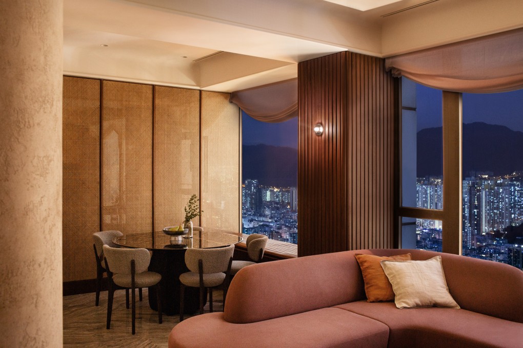
East meets West in luxury Hong Kong home’s design with European styling – think rattan panels, marble bathrooms, soft colours and a wall of windows
- The designer in charge of turning a Tai Kok Tsui penthouse into a home stripped the flat back to a shell to come up with a plan to make it feel more spacious
- The living room has a wall of windows and a soft, earth-toned palette, while the bathrooms have marble and dark green tiles to add to the modern European feel

A contemporary European vibe tinged with luxurious elements of Hong Kong style might sound somewhat incongruous, but business owner Cheung Lok-lam would beg to differ. This is what he had in mind when he collaborated with design studio LAUD on his 900 square foot (84 square metre) penthouse in Tai Kok Tsui, Kowloon, and a little bit of magic happened.
“You can imagine this place in Italy or France because of the special textural paint treatment on the walls and the use of rattan, whereas the refined wood panelling and the marble represent the Hong Kong definition of what makes a luxury home,” explains LAUD founder Liz Lau Win-wa.
Although the three-bedroom, two-bathroom flat was a new build when Cheung bought it in 2021, its long and narrow floor plan was restrictive and made it hard to achieve the sense of space he wanted.
Lau and her team stripped it back to a shell and started again. As one of Cheung’s two daughters studies abroad, he decided she could share her sister’s bedroom whenever she returned, and so the third bedroom was merged with the dining area to make the communal living space larger.
A wall of windows and a soft, earth-toned palette also helped make the room feel more open.
“The goal was to find ways to enlarge the main areas or at least give an impression of space,” says Lau. “We used simplicity as the driving force behind the design but with well-thought-out details, such as the inclusion of curves that flow through each room and give the flat cohesion.