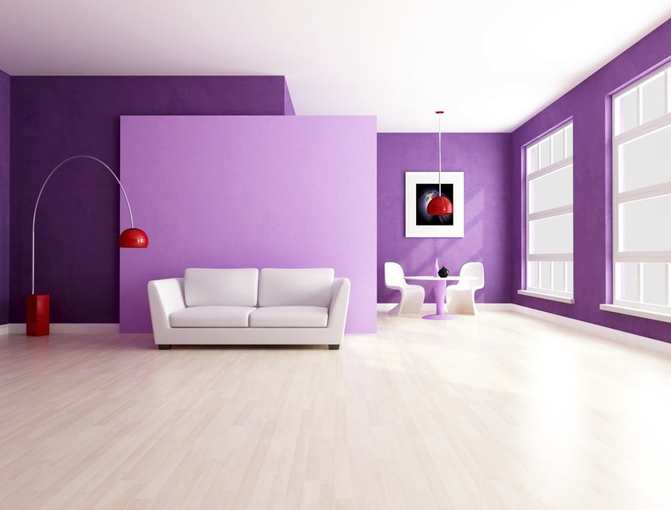
Pantone’s colour of 2018 is ultraviolet, but how do you use it at home?
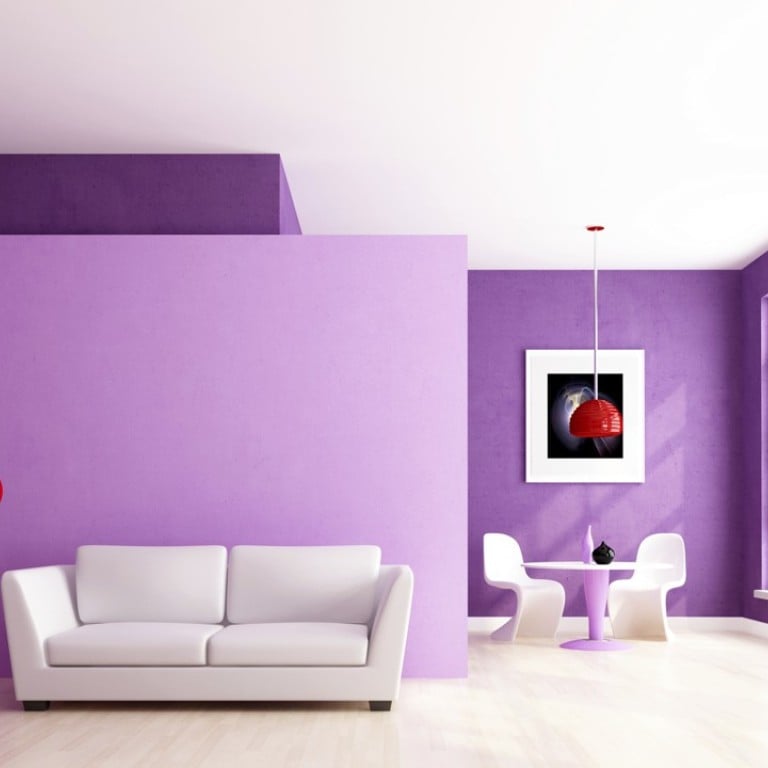
Pantone – aka the power to be in the chromatic world – has declared that the colour of the year is ultraviolet. The snazzy shade of purple makes for a bold design statement, but how does one use it at home without feeling like you are living in an oversized grape?
Architect Jean-Michel Gathy has some useful tips for colour coding that will help.
1. Steer clear of monotone
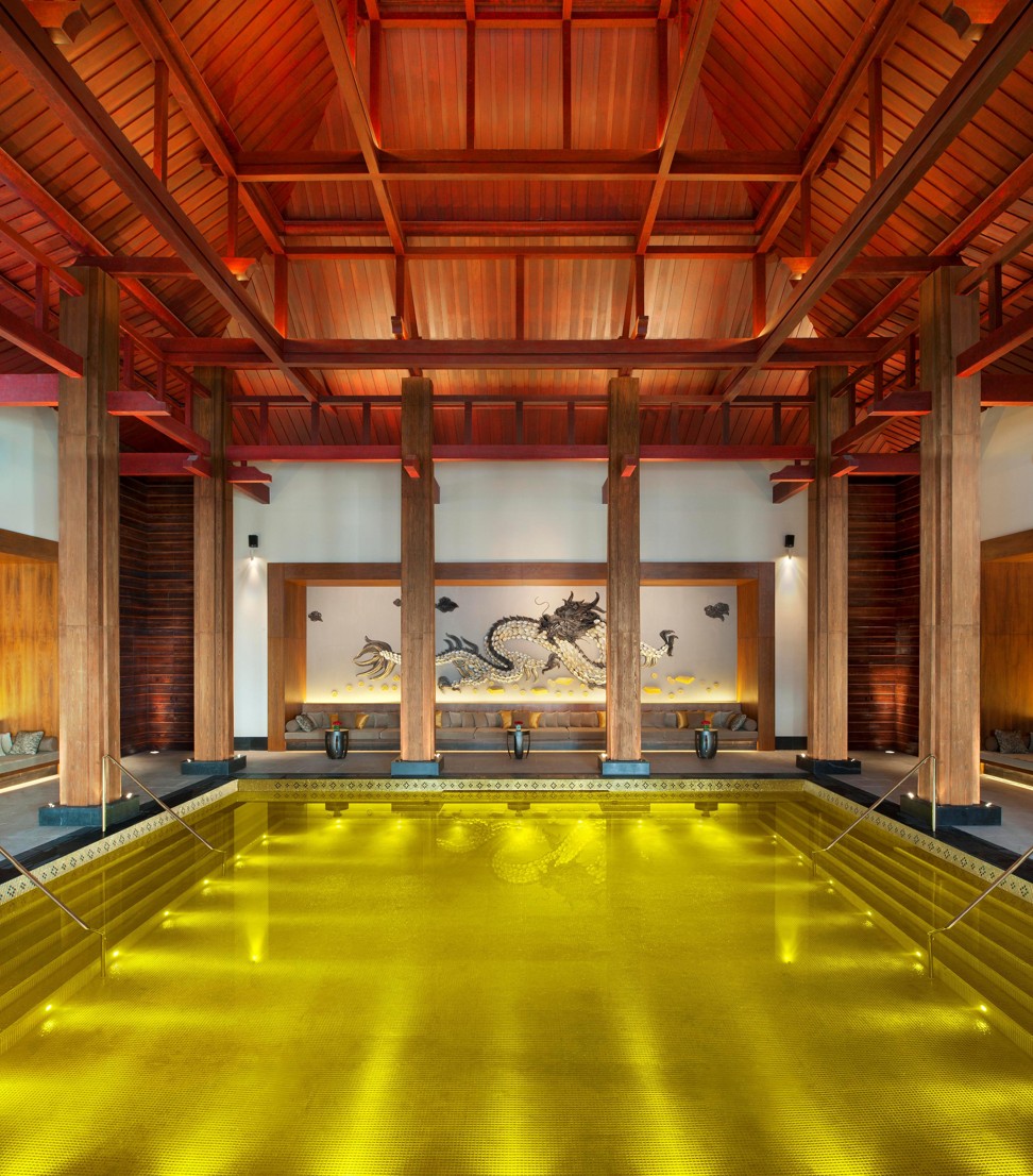
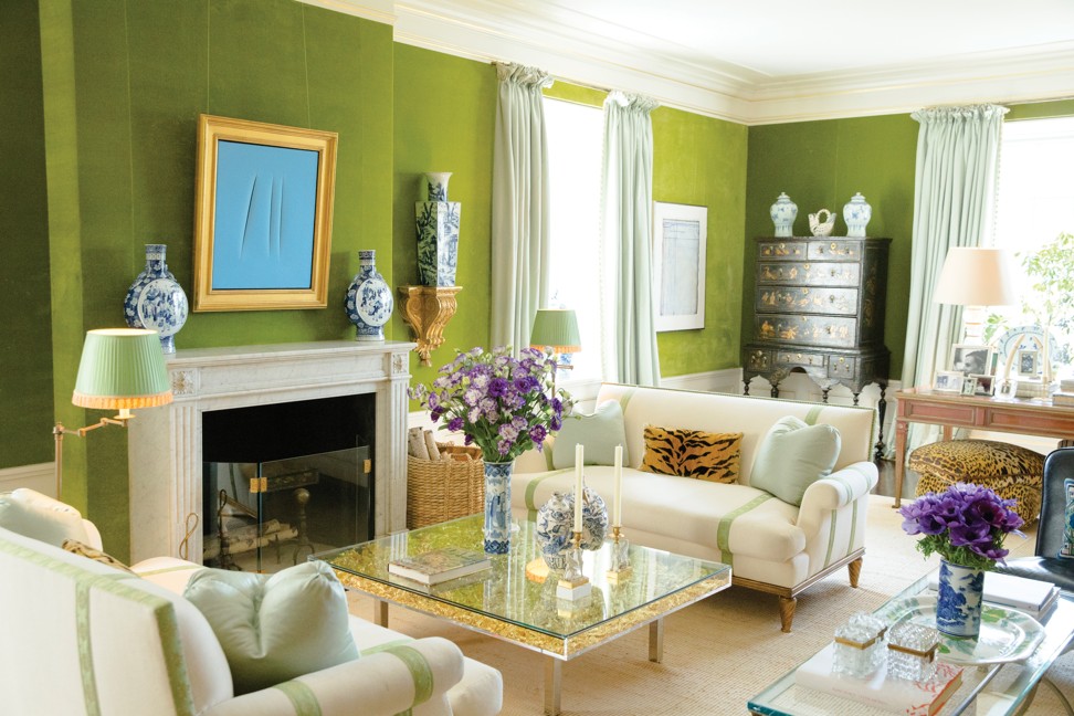
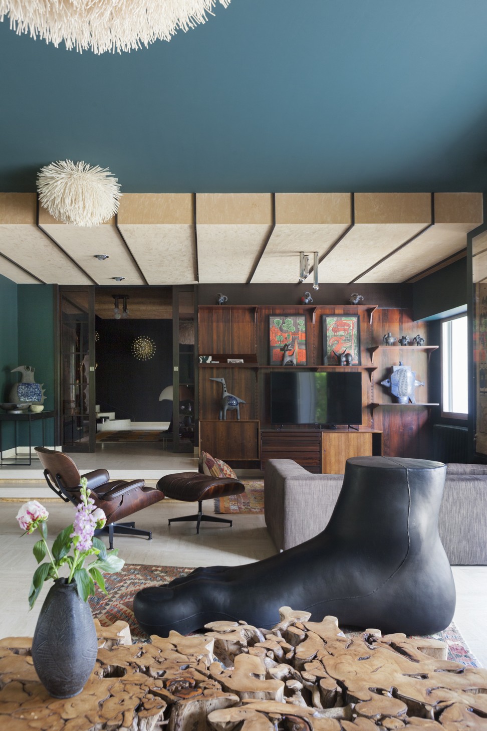
It’s boring, it’s lazy, and in the case of ultraviolet, it can be scary. Rather, pair different hues together for a more exciting palette. “Too much tone on tone is quite boring. The colours you choose do not always have to match, but should complement one another,” Gathy says.
2. Keep things in proportion
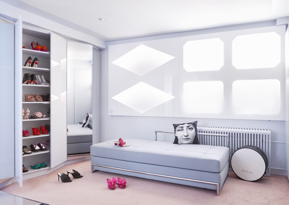
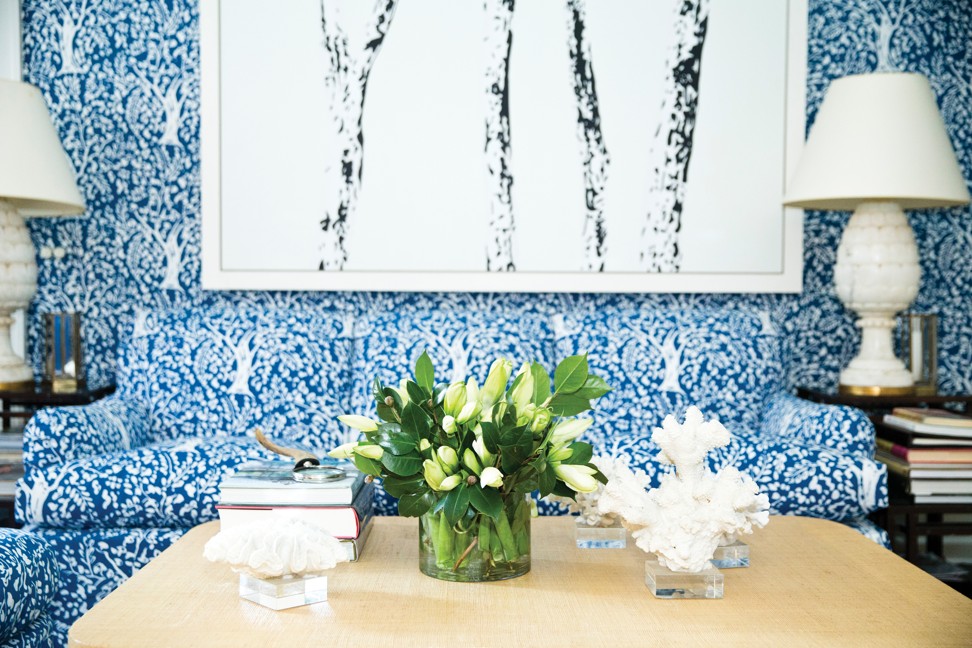
Remember that you have to actually live in this space, so don’t get carried away with too many strong colours and patterns. Gathy suggests grounding the room with neutrals, and then adding colourful highlights through accessories. “Be careful not to over-mix patterns, otherwise they’ll start to compete with each other,” he says. “Offset patterns with neutral breaks to create balance so the eye isn’t challenged. For example, if you have busy, multi-coloured pillows, opt for a more streamlined geometrical rug in black and white or tones of beige.”
3. For you: set the mood
On a purely personal level, how would you like to feel when you’re in this space? The final colour palette could be the difference between feeling relaxed or energised in a room. “Colour has an immediate effect on mood – the ability to calm or invigorate – and creates energy and depth of field,” Gathy says. “It’s a powerful thing, and used intelligently, it can be a beacon for inspiration.”
4. For guests: send a message
Your home decor tells your visitors who you are and what you like. Vibrant reds and strong geometric patterns, for example, would send a very different message than a soft palette of neutrals and pastels. “Colour has an immediate and enormous effect on the atmosphere”, Gathy says. “If you enter a dark home, your mood instantly changes.”
5. The bigger picture
You might like the idea of an all-pink bedroom and a black and gold kitchen, just remember that you’ll be experiencing your home as a whole. Gathy emphasises that continuity is important: “The beauty of decorating a home is that each room can look and feel distinctive, so you can use a different colour scheme in every space if you choose. The trick is to create cohesiveness by choosing complementary colours where rooms connect.”

Architect Jean-Michel Gathy teaches us how to use colour at home
