‘A Hong Kong story’: typography exhibition explores old Kowloon communities around gleaming new Kai Tak
- The exhibition at Gate33 in Kai Tak’s Airside uses typography to explore the communities and culture of Wong Tai Sin, San Po Kong, Kowloon City and To Kwa Wan
- The interactive show features works by 10 designers and artists, including graphic designer and sign maker Katol Lo, and industrial designer Lee Chi-wing
Visiting Kai Tak for the first time can be a bewildering experience.
An entirely new neighbourhood has emerged after years of walled-off construction on the site of Hong Kong’s former airport, studded with gleaming landmarks such as Airside, a shopping centre developed by Nan Fung and designed by Norwegian architects Snohetta.
But deep inside this slick mall is Gate33, an art space that reflects the older, more familiar parts of the city that surround Kai Tak.
That is especially true in its latest exhibition, TypePOP Show, which uses typography to explore the built environments, communities and culture of Wong Tai Sin, San Po Kong, Kowloon City and To Kwa Wan.
“Kai Tak is a new area – we’ve got new malls and new residential areas, new street names we’ve never heard before,” says Daisy Chu, who co-curated the show with Ire Tsui. “But a lot of older neighbourhoods are quite close, only 10 to 15 minutes’ walk.
“The first people coming to [Airside] were from those areas. So we thought, how can we take inspiration from those communities?”
11 of the best Hong Kong neon signs – catch them while you still can
The result is an immersive and interactive show with works by 10 designers and artists, including graphic designer and sign maker Katol Lo, graphic designer Jonathan Mak, typography and sign collector Adonian Chan, and industrial designer Lee Chi-wing, founder of Milk Design. It runs until June 12.
“Everything in the exhibition comes from the streets,” Chu says.
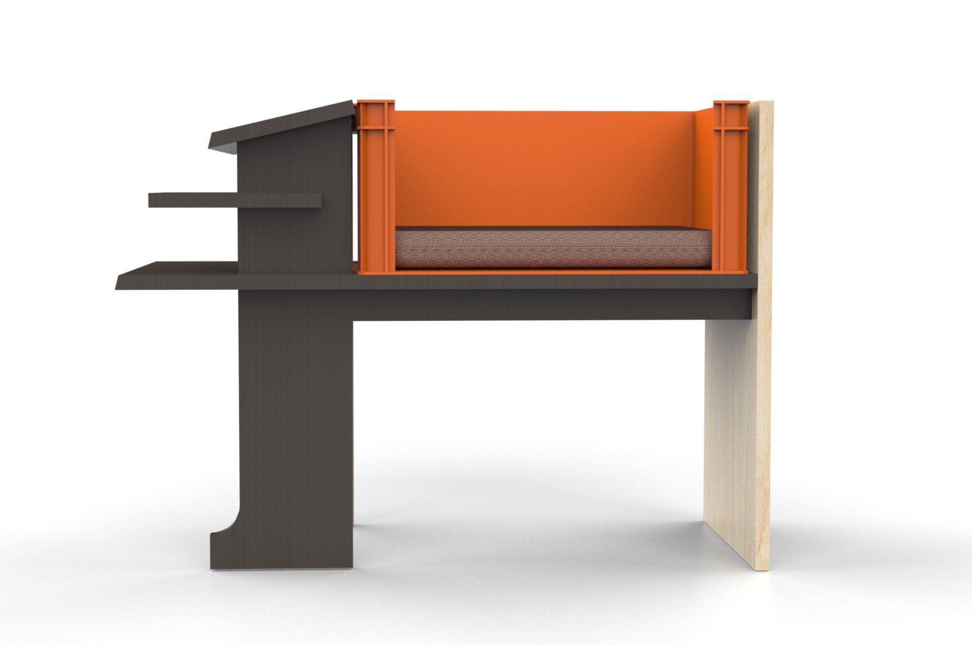
In one exhibit, Lee worked with emerging designer Kennif Li to create a new font inspired by the industrial history of San Po Kong, which was then transformed into three-dimensional pieces of furniture shaped like Chinese characters.
Chan is known for collecting old shop signs and developing a font called Beiwei Kaishu that is based on a uniquely Hong Kong style of calligraphy. For TypePOP, he took inspiration from the Wong Tai Sin Temple to explore Taoist calligraphy.
Local toy design studio LeeeeeeToy created a vinyl figurine that looks like the Chinese character for “person”, which design studio Hato turned into an interactive digital installation in which exhibition visitors can perform as the character itself.
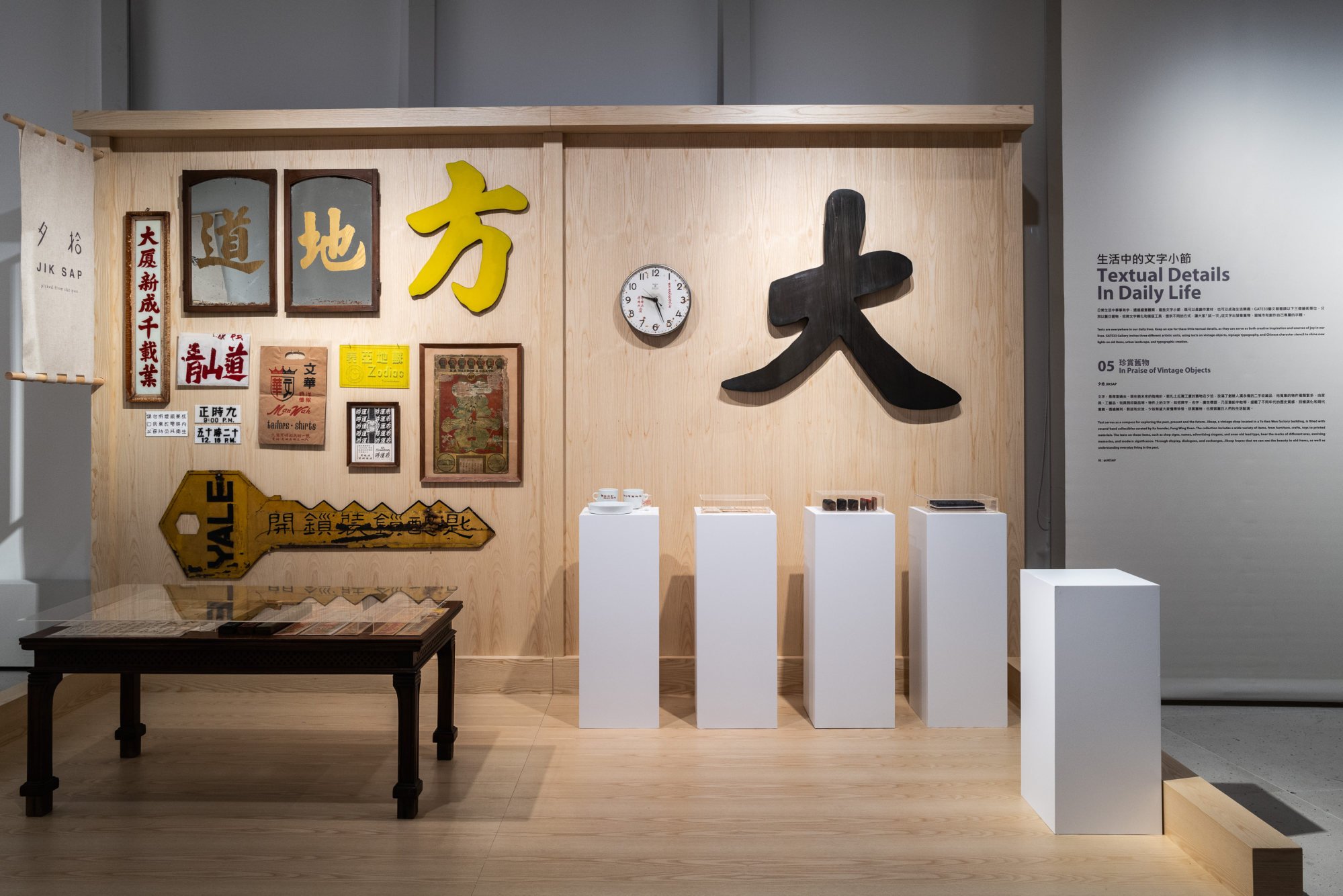
The show also includes stencils created by graphic designer Jason Chan that allow visitors to create their own signage; a review of the calligraphy found in Hong Kong public spaces by Instagram account Citywording; and vintage objects with local-style calligraphy and typography collected by Jiksap, an antiques shop in To Kwa Wan.
All of those works can be found at the tail end of the exhibition.
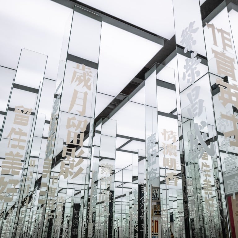
What visitors encounter first, however, is a walk-through installation by Lo called the Infinite Mirror Room of Bestowment, which includes hand-lettered signs inspired by the graphic landscape of To Kwa Wan, along with 110 four-character aphorisms engraved on mirrored pillars.
The work was inspired by engraved mirrors found in traditional Chinese medicine and bone-setting clinics. Co-curator Chu discovered these mirrors were donated by satisfied patients who wanted to express their gratitude with a gift.
Inspired by this old tradition, Chu and Lo hosted workshops at various businesses around the neighbourhood – a Thai restaurant, a hostel and a coffee roastery – to collect words of praise from local residents.
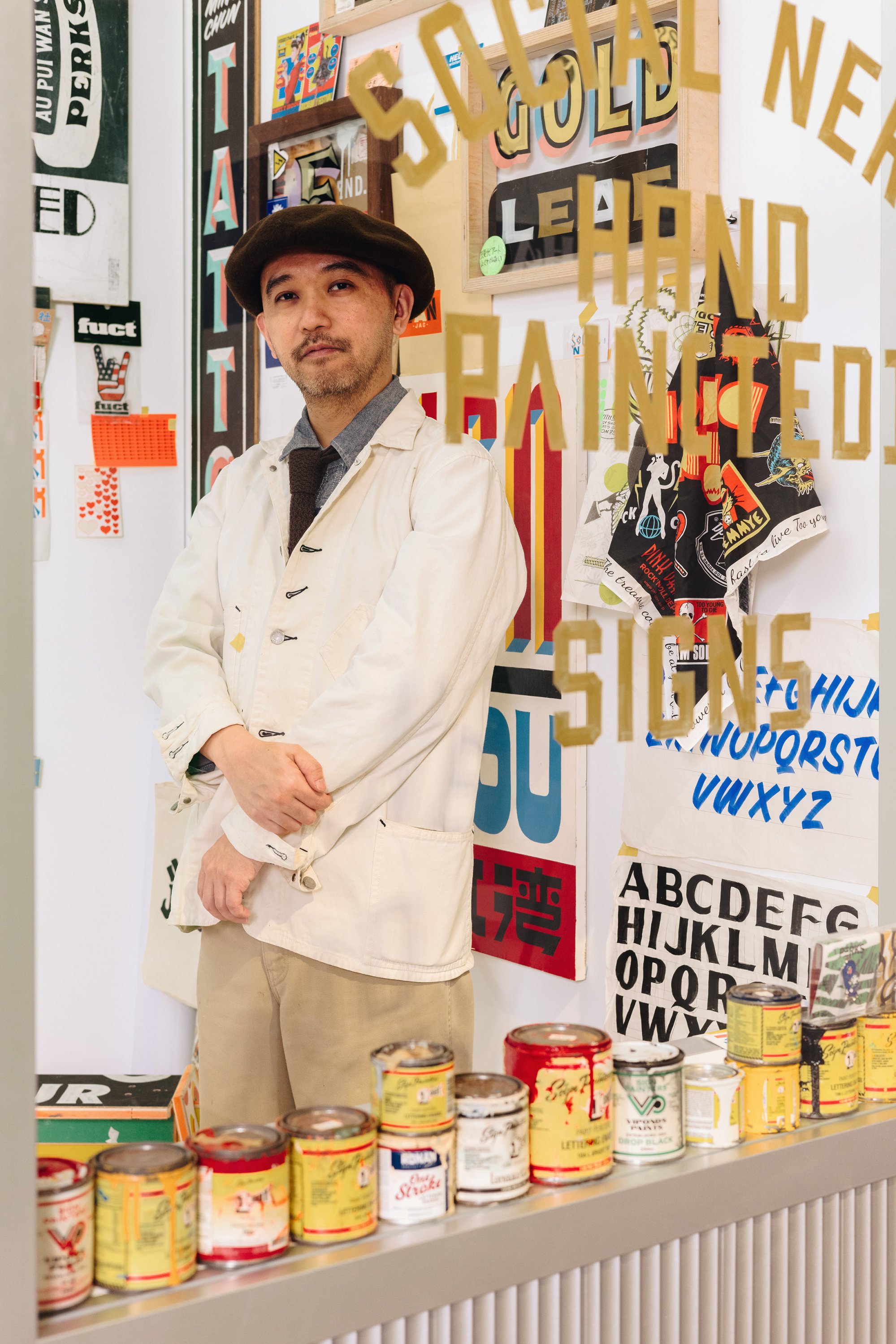
Lo transformed these messages into inscriptions whose typography recalls the handcrafted signs once common in Hong Kong, with distinct styles of writing that gave the city a visual landscape different from anywhere else in China or the world.
“It’s not only my work, it’s the work of the people of To Kwa Wan,” Lo says. “They have a very strong community, and they’re full of interesting stories.
“All typography was handmade in the past,” he adds. “Today it’s just fonts downloaded from the internet.”
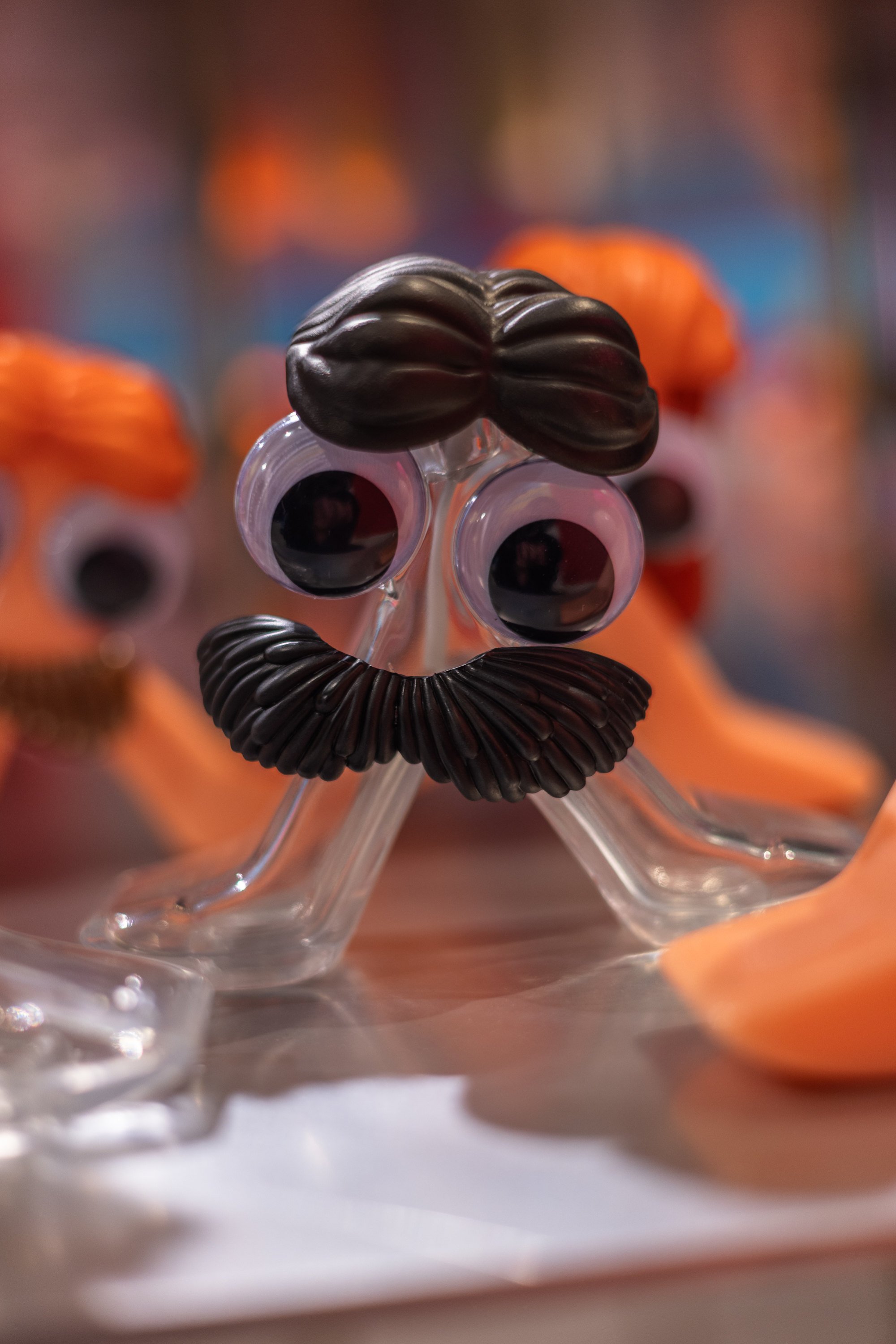
Mak was similarly inspired by the typographical landscape of Kowloon City, but the outcome of his work is entirely different.
Working with a Thai community group, Mak invited the neighbourhood’s children to share their thoughts and impressions of Kowloon City.
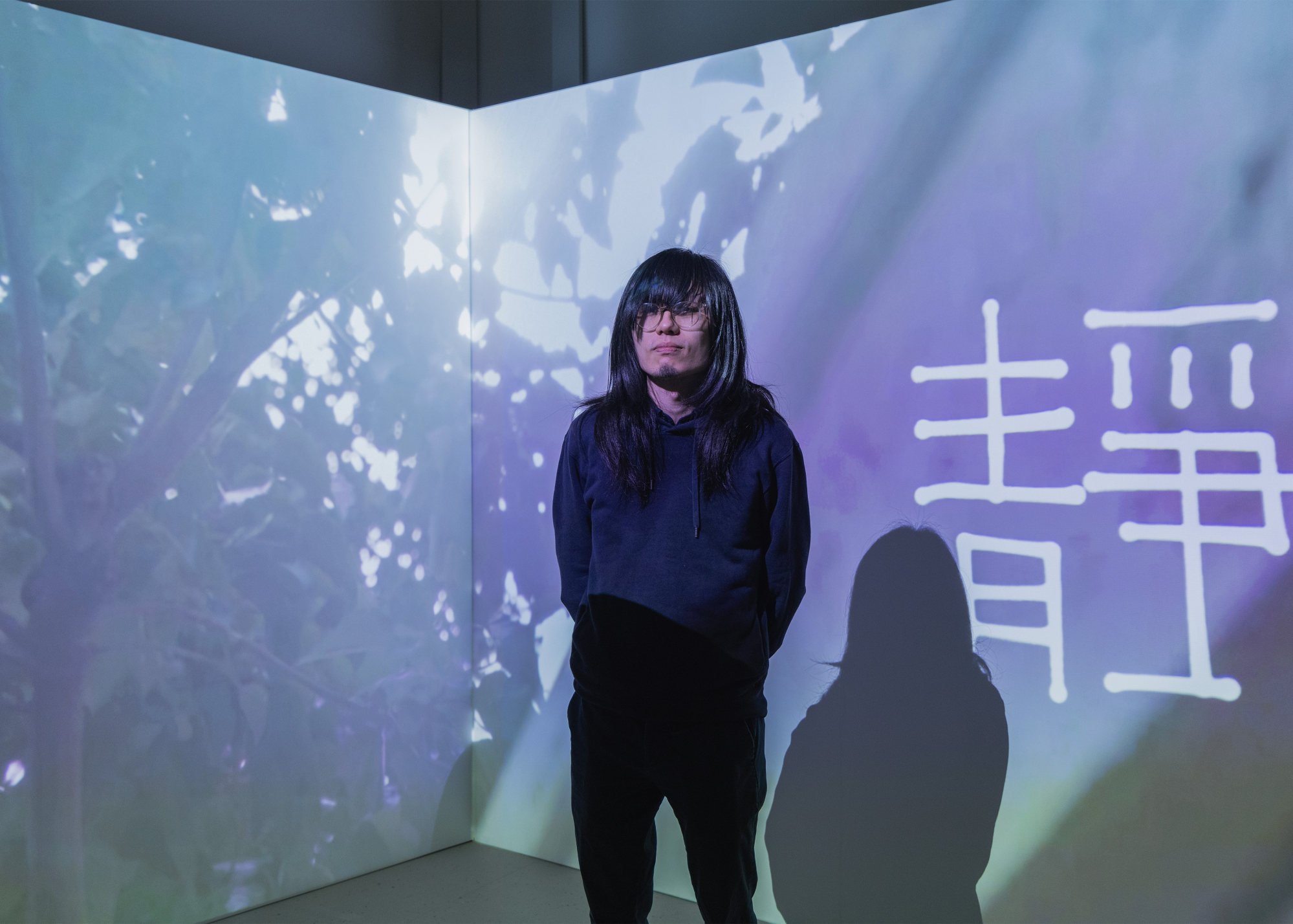
He then used an oscilloscope – a device that transforms sound waves into graphics – to turn their words and other neighbourhood sounds into common components of typography or graphics, such as the character for “meat” found in many restaurant or butcher shop signs, or the green man in pedestrian crossing signals.
Visitors to the exhibition can then transform those symbols by speaking or making sounds.
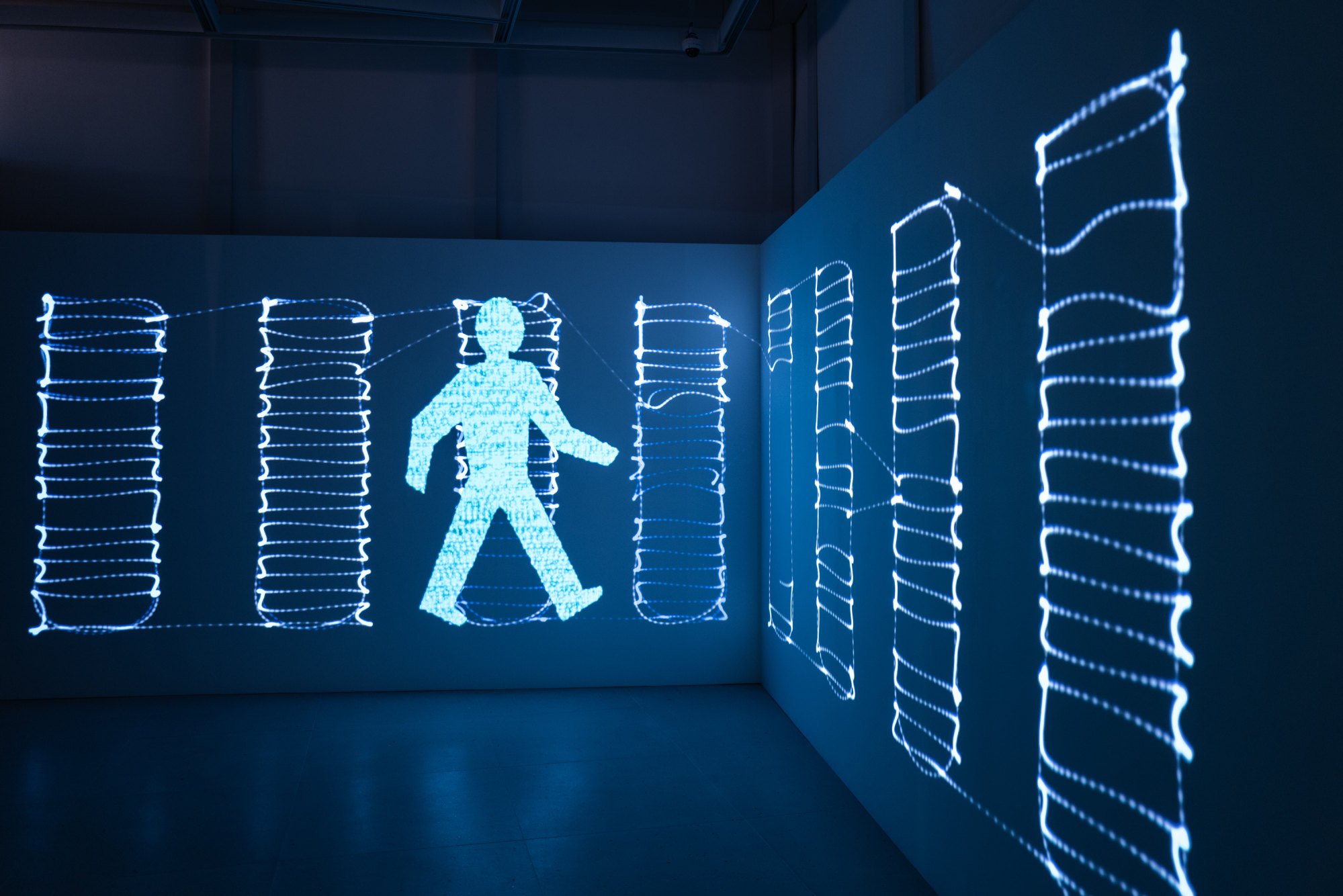
“You’re literally seeing the soundwaves you’re hearing,” Mak says. “I find it quite satisfying when you find the right motion that echoes the visual rhythm of typography.”
The exhibition has struck a chord with locals, who queue up at weekends for the show.
“Even if you don’t know anything about design, you’ll still learn something about the community,” Lo says. “It’s a Hong Kong story.”
TypePOP Show, Gate33, Airside, Concorde Road, Kai Tak, Hong Kong. Until June 12

